Forbes Connect Redesign

My team managed the entire site redesign from strategy through execution—working cross-functionally with developers and marketers to modernize the user interface, streamline navigation, and enhance overall functionality. Knowing stakeholders would be updating the site regularly, we focused on building a modular system that’s easy to use and hard to break. The full redesign is set to launch in August 2025.
Timeline
Q3 2025
My Role
Design Lead/Art Director
Team
3 designers, 2 devs, 2 project managers
01 Research & Ideation
The nav was messy, the pages were inconsistent, and users were getting lost. We took a product-minded approach by auditing the pain points, gathering best-in-class examples, and turning our findings into building blocks for a new design system.
02 Simplified Navigation
After identifying common points of confusion, we rebuilt the navigation from the ground up—grouping content by user intent, reducing page count by over half, and making high-value info easier to access.
03 Content-First
Working closely with marketing stakeholders, we took a content-first approach, aligning on messaging and key features page by page. This collaboration ensured that every piece of content was purposeful, clear, and ready to inform the design of each page template.
04 Component Library
We then created a component library to centralize all design elements, enabling faster iteration and consistency across the site. By building reusable, customizable modules, we ensured the design could scale with future updates and stakeholder needs.
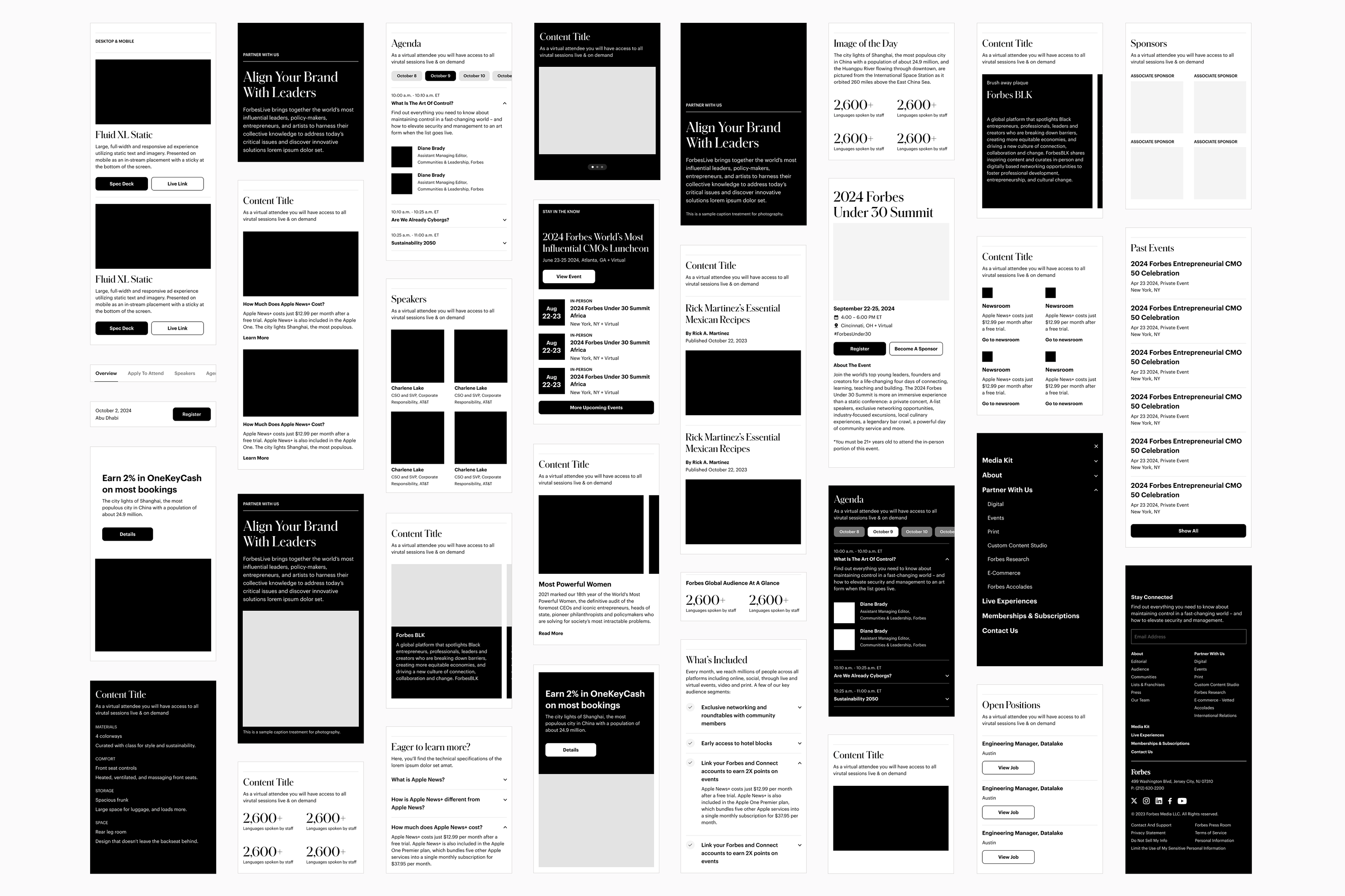
05 Final Designs
After finalizing components, we then transitioned to Figma for page build outs. Every screen was annotated with precise specs and interaction guidelines to facilitate a smooth, efficient hand-off to the dev team. We also used this phase to establish cohesive imagery guidelines.
06 Implementation
We worked closely with the internal dev team to QA every page. Reviewing staging links, flagging bugs, and ensuring everything matched the designs. While some pages are still rolling out, the full launch is on track for August 2025.
 Before
  After
After 


 Site Nav
  Event Registration Landers
  Live Events Hub
  Lists & Franchises Hub
  Print & Magazine
  Ad Product Suite
  Media Kit & Calendars
  Vetted
  Editorial
  About & Leadership